

Introduction
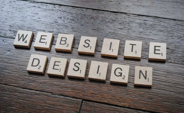
A website is more than just an online presence.7 Costly Website Design Mistakes That Hurt Sales.
Having a beautiful website alone is not enough. If visitors have trouble navigating it, they will leave within seconds. Websites are more than just online presences. It’s your digital storefront, your salesperson, and often your first impression to your customers.
Website design is often ignored by business owners who spend thousands of dollars on advertising. According to multiple industry studies, nearly 94% of first impressions are influenced by website design, which means 88% of online shoppers won’t return after an unsatisfactory website experience.
The truth is simple.
Small website design mistakes can cost businesses thousands of dollars every year.
Here you’ll discover 7 Costly Website Design Mistakes That Hurt Sales, discover why they happen, see real-world statistics, and understand how to correct them before they ruin your business.
Table of Contents
Quick Overview
| Website Design Mistake | Impact on Sales | Difficulty to Fix |
|---|---|---|
| Slow Loading Speed | Very High | Medium |
| Poor Mobile Design | Very High | Medium |
| Confusing Navigation | High | Easy |
| Weak Call-to-Action Buttons | High | Easy |
| Too Much Clutter | Medium | Easy |
| Poor Trust Signals | High | Easy |
| Bad Checkout/User Journey | Very High | Medium |
Website Conversion Funnel
Website Visitor
       │
       ▼
First Impression
       │
       ▼
Easy Navigation
       │
       ▼
Build Trust
       │
       ▼
Clear CTA
       │
       ▼
Purchase
A mistake at any stage can reduce conversions dramatically.
Why Website Design Matters More Than Ever
Today’s online users are impatient.
If your website looks outdated or difficult to use, visitors quickly move to your competitors.
Recent research shows:
| Statistic | Value |
|---|---|
| Users judge a website within | 0.05 Seconds |
| Mobile users worldwide | Over 60% |
| Visitors who leave after poor experience | 88% |
| People expecting pages to load within | 2–3 Seconds |
These numbers prove that good design directly affects sales.
Mistake #1 – Slow Website Loading Speed
The first and perhaps biggest mistake is a slow-loading website.
Visitors expect instant results.
Every extra second increases the chance they’ll leave.
Imagine clicking on an online store.
The page loads…
You wait…
Nothing happens…
Most users simply close the tab.
Your potential customer is gone before seeing your product.
Why Slow Websites Lose Customers
People value convenience.
Fast websites feel professional.
Slow websites create frustration.
Google also considers page speed as an important ranking factor.
That means slow websites lose:
- Organic traffic
- Customer trust
- Sales
- Search rankings
Real Statistics
Research from Google and industry reports shows:
| Loading Time | Bounce Rate Increase |
|---|---|
| 1 Second | Baseline |
| 3 Seconds | +32% |
| 5 Seconds | +90% |
| 6 Seconds | +106% |
| 10 Seconds | +123% |
Every second matters.
Common Reasons Websites Are Slow
Many websites become slow because of simple mistakes.
Examples include:
- Large images
- Too many plugins
- Poor hosting
- Unoptimized code
- Heavy animations
- Uncompressed videos
- Too many fonts
Even attractive websites fail if they load slowly.
Real Example
An online clothing retailer noticed visitors leaving before browsing products.
After improving loading speed from 5.8 seconds to 2.4 seconds, they experienced:
- 24% higher conversions
- 18% lower bounce rate
- 31% more page views
The design didn’t change.
Only the speed improved.
Signs Your Website Is Too Slow
You may have this problem if:
- Visitors leave quickly.
- Bounce rate is high.
- Sales remain low despite traffic.
- Customers complain about loading.
- Google rankings continue dropping.
How to Fix Slow Website Speed
Start with these improvements:
Compress images
Use modern image formats
Remove unnecessary plugins
Enable browser caching
Use a Content Delivery Network (CDN)
Upgrade your web hosting
Minify CSS and JavaScript
Reduce redirects
Speed Improvement Checklist
□ Compress Images
□ Enable Caching
□ Minify CSS
□ Minify JavaScript
□ Faster Hosting
□ CDN Enabled
□ Remove Unused Plugins
□ Optimize Database
□ Lazy Load Images
□ Reduce HTTP Requests
SEO Benefits of Faster Websites
Improving website speed offers several benefits:
- Better Google rankings
- Lower bounce rate
- Higher customer satisfaction
- More page views
- Better user experience
- Increased sales
- Stronger brand reputation
A faster website is one of the easiest ways to increase online revenue.
Mistake #2 – Ignoring Mobile Users
Business owners make a costly mistake by focusing exclusively on desktop visitors when designing their websites.
Today, mobile traffic dominates the internet.
More than half of all website visits come from smartphones and tablets.
If your website isn’t mobile-friendly, you’re losing customers every single day.
When visitors can’t navigate your website comfortably with one hand, they’ll likely leave before buying. If they need to zoom or scroll sideways, they’ll likely abandon your website before buying.
Why Mobile Design Is Critical
People shop, compare products, read reviews, and complete purchases on mobile devices.
A poor mobile experience creates frustration and reduces trust.
It is possible that customers will choose a competitor with a more user-friendly mobile website, regardless of whether your products are excellent.
Mobile Usage Statistics
| Mobile Website Fact | Percentage |
|---|---|
| Global web traffic from mobile devices | Over 60% |
| Users unlikely to return after poor mobile experience | Around 61% |
| Users more likely to buy from mobile-friendly websites | Around 67% |
These numbers highlight why responsive design is essential for online success.
Common Mobile Design Problems
Many websites struggle on mobile because of issues such as:
- Tiny text that’s hard to read
- Buttons placed too close together
- Images that don’t resize properly
- Pop-ups covering the entire screen
- Menus that are difficult to navigate
- Slow loading on mobile networks
Each of these problems can reduce conversions and increase bounce rates.
Mobile-Friendly Checklist
□ Responsive Layout
□ Readable Fonts
□ Large Buttons
□ Fast Mobile Speed
□ Easy Navigation
□ Optimized Images
□ Clickable Contact Information
□ Simple Checkout Process
User experience is improved, search engine rankings are improved, and sales are increased with a mobile-friendly website.
Mistake #3 – Confusing Website Navigation
Imagine walking into a supermarket where nothing is labeled.
You need milk, but there are no signs.
You ask an employee, but nobody helps.
Eventually, you leave and shop somewhere else.
This is exactly how visitors feel when your website navigation is confusing.
You can protect your site from cost-cutting mistakes by making it easy for users to find what they need. Even if your products or services are excellent, poor navigation can drive customers away before they reach your checkout page.
Why Navigation Matters
Website navigation acts like a roadmap.
It helps visitors quickly move from one page to another.
When users cannot find information within a few seconds, they often leave your website.
Simple navigation improves:
- User experience
- Page views
- Customer trust
- Conversion rates
- Sales
Signs Your Navigation Needs Improvement
Many business websites unknowingly suffer from navigation problems.
Common warning signs include:
- Too many menu items
- Hidden important pages
- Broken links
- Unclear page names
- No search feature
- Difficult mobile menus
- Customers asking where to find basic information
Website Navigation Statistics
| Navigation Factor | Effect |
|---|---|
| Visitors expect navigation within | 3–5 Seconds |
| Users leave if they can’t find information quickly | Around 60% |
| Simple navigation increases conversions | Up to 18% |
| Websites with clear menus have lower bounce rates | Yes |
Poor Navigation Example
Bad Menu
Home
Products
Services
Solutions
Resources
Library
Support
Knowledge
Articles
Insights
Contact
Store
Partners
Events
News
About
More
Visitors become overwhelmed.
Better Navigation
Home

Products

Pricing

About

Blog

Contact
Simple navigation reduces confusion.
Navigation Best Practices
Keep menu items between 5–7 options.
Use clear page names.
Add a search bar.
Keep navigation consistent across every page.
Include breadcrumb navigation.
Make menus mobile-friendly.
Highlight your most important pages.
Text Infographic
Visitor Arrives

      │

      ▼

Easy Navigation

      │

      ▼

Find Product

      │

      ▼

Build Trust

      │

      ▼

Purchase
Simple navigation creates a smoother customer journey.
SEO Benefits
Good navigation helps search engines understand your website structure.
Benefits include:
- Better indexing
- Improved rankings
- More page views
- Longer session duration
- Lower bounce rate
Mistake #4 – Weak Call-to-Action (CTA) Buttons
Poor Call-to-Action buttons are one of the main reasons why websites receive traffic but do not generate sales.
A Call-to-Action tells visitors what to do next.
Without clear CTAs, users become confused.
Many simply leave.
This is one of the most overlooked 7 Costly Website Design Mistakes That Hurt Sales.
What Is a Call-to-Action?
A Call-to-Action (CTA) is any button or link encouraging visitors to take action.
Examples include:
- Buy Now
- Start Today
- Get Started
- Download Free Guide
- Contact Us
- Request a Quote
- Subscribe
- Shop Now
Every page should guide visitors toward one clear goal.
Characteristics of Strong CTAs
Good CTA buttons are:
- Easy to see
- Simple to read
- Action-oriented
- Positioned strategically
- Visually different from surrounding content
Weak vs Strong CTA Examples
| Weak CTA | Strong CTA |
|---|---|
| Submit | Get My Free Quote |
| Click Here | Start Saving Today |
| Learn More | Discover Your Perfect Plan |
| Continue | Shop Best Deals Now |
| Send | Contact Our Experts |
Action words encourage more clicks.
CTA Placement Matters
Your CTA should appear:
- Above the fold
- After explaining benefits
- At the end of blog posts
- On landing pages
- Inside product pages
- Near testimonials
- Before checkout
Too many CTAs can confuse visitors.
One primary CTA usually works best.
Real Example
A software company changed one button.
Old CTA:
SubmitNew CTA:
Start My Free TrialThe result:
- 28% more clicks
- Higher sign-up rate
- Increased sales without additional advertising
Small wording changes can produce impressive results.
CTA Statistics
| CTA Improvement | Average Result |
|---|---|
| Personalized CTA | Higher conversions |
| Clear action words | More clicks |
| Contrasting button colors | Better visibility |
| Single CTA focus | Improved user decisions |
Common CTA Mistakes
Avoid these errors:
Tiny buttons
Hidden buttons
Generic wording
Too many buttons
Poor color contrast
Long button text
No urgency
Text Infographic
Visitor Reads Page

        │

        ▼

Interested

        │

        ▼

Clear CTA Button

        │

        ▼

Clicks

        │

        ▼

Purchase
Every successful sales page follows this simple path.
Writing Better CTA Text
Instead of writing:
- Submit
- Continue
- Click Here
Try:
- Buy Now
- Claim Your Discount
- Start Free Today
- Download Now
- Get Instant Access
- Book Your Consultation
- Shop Today’s Deals
Strong action words encourage visitors to move forward.
CTA Design Checklist
□ Easy to Find

□ Bright Contrast

□ Large Button

□ Mobile Friendly

□ Action-Oriented Text

□ One Main CTA

□ Positioned Above Fold

□ Repeated Naturally
Why CTA Optimization Increases Sales
Visitors rarely buy immediately.
Your CTA acts as a guide.
A well-designed button reduces hesitation and increases confidence.
Businesses often focus on advertising while ignoring CTA optimization.
One of the easiest ways to increase conversions without increasing marketing costs is to improve CTA design.
Key Takeaways from Part 2
| Website Design Mistake | Impact on Sales | Priority |
|---|---|---|
| Confusing Navigation | High | Fix Immediately |
| Weak CTA Buttons | Very High | Fix Immediately |
The two mistakes can drastically reduce conversion rates, even if your website attracts a lot of visitors. Make sure your navigation is simple and easy to use, and make sure your CTA is strong.
Mistake #5 – Too Much Visual Clutter
It is quite common for website owners to believe that by adding more content, more colors, more banners, and more animations, they will impress visitors. However, this is often not true.
Cluttered websites can overwhelm users, making it hard for them to focus on what is important. Visitors may leave without taking the time to read your content or explore your products.
Designing pages that are visually crowded instead of clean and organized is one of the 7 Costly Website Design Mistakes That Hurt Sales.
What Is Visual Clutter?
Visual clutter occurs when a webpage contains too many competing elements.
Examples include:
- Too many colors
- Multiple fonts
- Flashing animations
- Large pop-ups
- Too many advertisements
- Excessive images
- Long paragraphs without spacing
- Too many buttons
Instead of guiding visitors, clutter distracts them.
Signs Your Website Is Cluttered
- Every section uses different colors.
- The homepage is packed with information.
- Multiple pop-ups appear at once.
- Visitors don’t know where to click first.
- There isn’t enough white space.
- Important buttons blend into the background.
Clean Design vs. Cluttered Design
| Cluttered Website | Clean Website |
|---|---|
| Too many colors | Consistent color palette |
| Many fonts | One or two fonts |
| Excessive animations | Simple transitions |
| Too many ads | Limited advertisements |
| Crowded layout | Plenty of white space |
| Confusing content | Easy-to-read sections |
Benefits of a Clean Website
A clean layout helps visitors:
- Read content easily
- Find important information faster
- Trust your business
- Stay longer
- Complete purchases
Simple design almost always outperforms complicated design.
Text Infographic
Too Much Clutter
        │
        ▼
Visitor Confused
        │
        ▼
Leaves Website
        │
        ▼
Lost Sale
Simple Design Checklist
Use consistent colors
Limit fonts
Add white space
Keep paragraphs short
Remove unnecessary animations
Highlight important buttons
Organize content with headings
Mistake #6 – Missing Trust Signals
Imagine visiting an online store you’ve never heard of.
There are no customer reviews.
No contact information.
No return policy.
No security badges.
Would you enter your credit card details?
Probably not.
The trust factor is one of the largest factors that influence online purchases. Without trust signals, even interested visitors may leave without making a purchase.
A customer needs reassurance before making a purchase, which is one of the 7 Costly Website Design Mistakes That Hurt Sales.
What Are Trust Signals?
Trust signals are elements that show your website is safe, reliable, and professional.
Common examples include:
- Customer reviews
- Testimonials
- SSL certificate (HTTPS)
- Secure payment icons
- Money-back guarantee
- Contact information
- Physical address
- Privacy Policy
- Refund Policy
- About Us page
- Awards and certifications
Why Trust Matters
People buy from businesses they trust.
Even a great product may not sell if the website appears unprofessional or suspicious.
Building trust increases confidence and reduces purchase hesitation.
Real Statistics
| Trust Factor | Customer Response |
|---|---|
| Positive customer reviews | Higher purchase confidence |
| HTTPS security | Increased trust |
| Money-back guarantee | Lower buying hesitation |
| Clear contact information | Better credibility |
Strong Trust Signals Checklist
□ SSL Certificate
□ Customer Reviews
□ Testimonials
□ Secure Payment Icons
□ Contact Page
□ About Us
□ Privacy Policy
□ Refund Policy
□ Social Proof
□ Frequently Asked Questions
Example
Low-Trust Website
- No reviews
- No company information
- Generic product descriptions
- No secure payment icons
Result:
Visitors hesitate.
Sales decrease.
High-Trust Website
- Verified customer reviews
- HTTPS security
- Professional design
- Clear contact details
- Refund guarantee
Result:
Visitors feel confident.
Conversions improve.
Mistake #7 – Complicated Checkout Process
You have done everything right.
Visitors found your website.
They liked your product.
They added it to the cart.
Then…
The checkout asks them to complete five pages of forms.
Many customers simply give up.
The most expensive Website Design Mistake That Hurts Sales is creating a lengthy and confusing checkout process.
Why Customers Abandon Checkout
Customers dislike unnecessary work.
The longer the checkout, the lower the conversion rate.
Every additional step increases the chance of losing a sale.
Common Checkout Mistakes
- Mandatory account creation
- Too many form fields
- Hidden shipping costs
- Limited payment methods
- Slow checkout pages
- Poor mobile checkout
- Complicated coupon process
Simple Checkout Process
Product Page
      │
      ▼
Add to Cart
      │
      ▼
Checkout
      │
      ▼
Payment
      │
      ▼
Order Complete
The fewer steps, the better.
Checkout Optimization Tips
Offer guest checkout
Minimize form fields
Display shipping costs early
Accept multiple payment methods
Show progress indicators
Optimize for mobile
Enable autofill
Provide order confirmation instantly
Comparison Table
| Poor Checkout | Optimized Checkout |
|---|---|
| Five pages | One or two pages |
| Mandatory signup | Guest checkout |
| Hidden fees | Transparent pricing |
| Limited payment options | Multiple payment methods |
| Confusing layout | Simple design |
Website Improvement Checklist
□ Fast Loading Speed

□ Mobile-Friendly Design

□ Easy Navigation

□ Strong CTA Buttons

□ Clean Layout

□ Trust Signals

□ Simple Checkout

□ Secure Website

□ High-Quality Images

□ Helpful Content

□ Fast Customer Support
Summary of the 7 Costly Website Design Mistakes That Hurt Sales
| Mistake | Sales Impact | Priority |
|---|---|---|
| Slow website speed | Very High | Immediate |
| Poor mobile design | Very High | Immediate |
| Confusing navigation | High | High |
| Weak CTA buttons | High | High |
| Visual clutter | Medium | Medium |
| Missing trust signals | High | High |
| Complicated checkout | Very High | Immediate |
Frequently Asked Questions (FAQ)
1. Why is website design important for sales?
Having a professional website improves user experience, builds trust, reduces bounce rates, and encourages customers to make a purchase.
2. What is the biggest website design mistake?
A slow loading speed is one of the most damaging mistakes since many visitors leave before the page has fully loaded.
3. How does mobile design affect conversions?
Most internet users browse on smartphones.In today’s world, most internet users browse the internet on their smartphones, making navigation easier and making purchases more likely.
4. Why are Call-to-Action buttons important?
A CTA button directs visitors toward actions such as purchasing a product, calling for a quote, or signing up for a newsletter.
5. How can I make my website more trustworthy?
Your privacy and refund policies must be published, your customer reviews must be displayed, and testimonials should be showcased.
Final Thoughts
A beautiful website does not automatically generate sales.
The success of a website depends on a combination of attractive design, excellent usability, speed, trust, and simplicity.
Avoid these 7 Costly Website Design Mistakes That Hurt Sales to build a website that not only attracts visitors, but also turns them into loyal customers. You can boost conversions and revenue over time by making even small improvements, such as speeding up your pages, simplifying navigation, strengthening your call-to-action buttons, reducing clutter, adding trust signals, and streamlining checkout.
Make sure that you regularly review your site’s performance, test different layouts and CTAs, monitor user behavior, and continue making data-driven improvements to optimize your site. It is easier to earn customer trust, improve search engine visibility, and achieve long-term growth when businesses continuously refine their websites.
It’s not just a website – it’s one of the most powerful sales tools you can have. Investing in better design today can deliver stronger customer experiences, higher conversion rates, and increased profits.